

You know those art studio apps that let you draw digitally and have access to plenty of tools to make art? Well, what if you wanted to bring in reference images to help with your art creations? Normally, that is a whole process to do, but what if the app did that for you.
Introducing the
ArtEngine Studio.
The Origin of the App Idea
The idea for this app came from my own first hand experience with an art studio app and wanting to bring in outside images to have my reference material with me when making art. It’s one of the reasons I prefer to physically draw art when I can, so that was my inspiration.

(Every type face used here: Boucherie Cursive, Black Ops One Regular, Monotype Corsiva, Algerian, Berlin Sans FB Demi Bold, Impact, Baloo Bhai Regular, Minion Variable Concept and Monsters Attack!)
First Ideations
Now, for my first ideations, I needed to first come up with a name that fit the idea. An art studio app with a built in search engine for reference images and other users and their work. So I took the Art Studio and combined it with search engine and made ArtEngine Studio.
Once I had the name, picking the right font or fonts to make my logo was the tricky part, as I was treating the name as two separate words, and I wanted some natural contrast.
This process took a lot of trial and error and seeing what type faces interact with others. My plan was to combine a handwritten style serif mixed with a standard sans serif.
Out of all the ideas I had, I was left with only one solid option. Taking the Boucherie Cursive font for the ArtEngine portion of the name (handwritten type because it represents the nature of art being drawn) and Black Ops One Regular for the Studio part of the name (a serif type based on stenciled letters (a style of hand drawn letters)) to give off the vibe the app is for art and creating masterpieces while also pulling in reference images to aid in creating original work.

The Logo Design
Now, for the logo of the app, I tried to make it not so cliche in my icon choices. I didn’t use a paintbrush or a ruler because those felt too on the nose, while a pencil is fine because I do need some kind of writing utensil to act for the art creation side of the app (and it also lends itself to the hand drawn type).

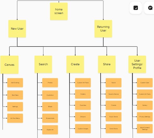
Information Architecture
The basic design of the app is simple. The main feature is the free draw canvas function, like any other art design app, but since it has a search engine built in, that is the secondary option. To go with those, a friend and favorite options exist to find other peoples’ work.


Low Fi Sketches
The low fi prototype frames were simple sketches of what I want the app to look like. At the time, the working title was ArtEngine, but then I realized that name is not specific enough for a product that is supposed to be an art studio first with a search engine added on.
Once I added the Studio part, the rest of the app came together in terms of what I wanted it to look like. Very simple navigation, but not enough options for the user. This was a problem I would fix for the hi-fi prototype.


Hi Fi Prototype
These are the hi-fi prototype screens. With the initial design, I added the logo and made a color palette for the app design.


UI Kit
This UI kit is a collection of every small icon, button and image used for the app creation. It also contains typefaces and color palette choices. The color palette of shades of purple, light blue came about because of the background image I chose for some of the frames. It matched the vibe of a creative app designed for original creations of art and design.
The reason for so many images is to simulate the search engine function for as many frames of the search feature as possible. After all, a real search engine has access to millions of images as long as they match the keywords in the search que.

Final Prototype
This is the final prototyped frames connected throughout the app.