Brand Creation

The Problem
This problem is my own branding, so I had to start somewhere. I had to come up with what fonts mixed with the right color palette would symbolize me as a brand and figure out the meaning why I chose what I did.
Visual Research
To start, I needed to do visual research on what brand identities look like to other people.


My Initial Sketches
To start off, I took inspiration from my visual research and then made some quick and rough sketches to make ideations of possible logos. Then I digitized the best ones I had and even found a typeface that fit one I hand drew. The “Boucherie Cursive” font.


Here is my first set of ideations. Here I came up with the idea of having my name surrounded by a mouse to symbolize a computer mouse to show my prowess with most technology.
The cursive one was inspired by the education I had in learning cursive and being able to sign for myself. It shows that I am proficient in cursive and it fits my personality.
The star was a spur of the moment idea, while the headphone looking one was inspired by my love of music. The final one is my initial done with electric eels, as they are my favorite marine animal.
Here is my second set of ideations. Here is where I decided to mess with how my name and initial look when done certain ways. The first two relate to using the sun and the moon, because of my sunny personality and how relaxing the moon can be.
The initials were just spur of the moment, but one is supposed to be tropical, and the other is insect wings. The other cursive one says the same thing as the previous one.
The name in the crystal was a spur of the moment idea that I thought looked cool but now looks dumb. The last one was another hand drawn idea that I did not like after I did it.
Here are some of my logos in Illustrator.
I embraced the sun and moon idea for the first two (I also attempted to use the Ai prompt generator to see what it could make and that is what the top right corner is). The one in between those two was supposed to be a sun, but it ended up as a chicken.
For the mouse idea I had before, I turned it into a computer mouse so the logo would have a double meaning to it (computer mouse for tech and regular mice for being small but fast with my work).
I converted the headphone idea into a simple negative space initial (which didn’t turn out the way I thought it would) and the 2 animal ones are here too. I found a cursive font and just typed out my name for the last one.
Boucherie Cursive
Out of all the ideas I had, I was left with only one solid option. The Boucherie Cursive font and now my job was coming up with the color palette.
My original plan was to use yellow and purple, to go with the sun and the moon motif I had going, but that was met with feedback saying the yellow was too bright and unreadable while the purple was fine. So I chose the light blue I am using now to compliment the purple instead.
Joseph Crickmore
The first one was my original plan, however the color was too bright for the yellow I chose and was told that the yellow with the purple is too much. So I changed gears from a contrasting pair to a complimentary pair. I landed on a blue of some kind because not many other colors compliment purple and that was a solid color choice to start with.
Joseph Crickmore
Design Process of my Brand
Once I had the type face and the colors I wanted, all that was left was to design the rest of my brand around those things. I needed business cards, a letterhead and my resume on said letterhead. So, I set out to work on those things.


First Versions
These are my first drafts of business cards, and let me tell you, when I got feedback on their design, it made me see just how they don’t quite look professional enough. Funny enough, the it was the type face that gave me trouble on the first couple because of the awkward negative space it made when I stacked my first and last name.
First Versions
As for these couple, I actually found a style that works for my cards, and the solution was to not stack my name, but to leave it all on one line. The other critique I got on the business cards was the legibility of the type on the back of the cards. They were not readable, so I went and fixed that by making it either white or black.
The important thing I left out was my profession. Saying what I do is half the point of a business card.
Final Version
Once I had the feedback on the business cards and making a small change to the letterhead, I finished them and now, I have a final version of my brand identity. Of course, if I decide later to change something or add something, these will also get updated if I want them to get updated.
As for the letterhead and the resume, I used the simplicity of my logo and the color choices to make a simplistic layout for my letterhead and then add on the resume content to make those official.


Final Version
As for which is my main one, I like one of the circle ones, and the all black one as a secondary option.
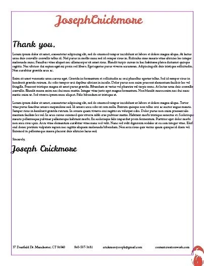
Letterhead & Resume


New Brand Creation
Time passed, and as I returned to this site, I decided to make a new brand for my site now that I have more knowledge on editing tricks and just coming up with new ideas. Of course I wanted to keep the idea of a cursive font, but picking a brand new one that was also cursive was fun, as was picking new colors and even a logo outline I actually liked this time around.
So, let’s look at the new and updated brand designs that I created.
Leckerli One
Well, that was my brand anyway but after some time had passed, I decided to change it up and make something new. I knew I still wanted the cursive font, so I just ended picking another cursive font and going from there.
That’s how I found Leckerli One as a font choice. It has the same cursive look that the other one did while also looking better as a header font for those big bold areas.

New ideas for the brand creation with different color palette options and a new angle for the logo. I chose the color palette at random actually with a random palette generator and for what it is, the palette works for a brand.
The main inspiration for why I chose a dragon to be the new logo.
The New Documents
This brand has given me new designs in everything a brand is, so therefore the previous documents would also be redesigned to match this new brand design. Below are only screenshots, but if you click the PDF section of the menu, you’ll see full PDFs you can see for yourself in better quality what these documents now look like.