Visionary Workspace

Yes, as you can see, me and a group of others worked to make a physical product with a digital interface and we came up with a digital desk. We call it the…
Visionary Workspace.

What is the Visionary Workspace?
This was a group work project where we had to come up with a physical product that would come with a digital UI built into its design. Since more and more appliances seem to have digital interfaces built in, we collectively thought what hasn’t been made widely accessible and what appliance could benefit from a digital UI and came up with a desk.

Design Research
Research done on existing appliances until the four of us came up with the idea for a desk.
From my perspective, most appliances that have UIs are kitchen appliances. So making a desk with a UI makes sense.
Problem Statement
We as a group decided on making a desk with a digital UI, but I was tasked with figuring out its individual selling points that an advertiser would want to focus on if this was a real product.
Since a desk already has features most people using it care about, like:
the ability to elevate the desk for people who prefer to stand
cabinets for storage inside the desk
the convenience of having somewhere to work on stuff,
So, the ideation phase of our desk was about innovation.
What can’t a desk do that ours can?
Goals & Objectives
Our goal-
to make a product that hasn’t been widely advertised yet with digital integration.
Once we came up with a desk, the objective-
to figure out how to design it so it would stand out as a product. What would make this “Digital Desk” (that was the working name) be unique and attract the people who would go on to use it.

Design Process
As for my section of the design phase, I was the one who came up with logo and icon ideas. None of which made it to the final phase, but I was the first one to think of the mobility function as I was drawing a desk.
Simply put, my vision of what a desk normally is wouldn’t work for our Visionary Workspace. We got feedback on the design being too standard and the screen was too small. So we made sure to enlarge the screen and change its shape, which made it to the end product.

What I Came Up With
For the features of the desk, I made sure to highlight the screen itself as the central advertising point, alongside its unique shape so it wouldn’t feel like an ordinary desk, and the most important feature a desk needs if it has technology built into it- the mobility to be able to move it and the flexibility to fit wherever the user needs to put the desk.
Of course, our desk takes the inspiration from the big screen and made ours a unique shape.
(Note: I did not make the images, as someone else in the group did)
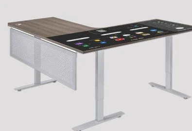
The L Shape
As this is a desk with a giant built in screen, the shape we made the desk had to be a unique shape to manage the screen and have extra room for just being a normal desk.
The design we ultimately ended up using was an L-shape. That way the screen could be one side, and the desk part could be the other part.
Width - 48 to 72 inches (122 to 183 cm)
Depth - 24 to 30 inches (61 to 76 cm)
Height - 29 to 30 inches (74 to 76 cm)

Logo Design
I specifically came up with the basic design for our logo once we had the name Visionary Workspace finalized. My design idea behind the logo was to take the L-shape of the desk combined with the “V” in Visionary Workspace to make it a compelling logo.
As I did not help make the final one, I was surprised with how the “W” ended up being incorporated, but now that I look at it, the W does its job in representing the workspace portion of the product name.

User Interface
As the digital part of the desk is the most important aspect of the desk’s selling point, we created an extensive UI just for the desk.
Of course, we didn’t completely redesign everything, but we replicated the features that work for phones and Ipads while formatting it for the desk.

Main menu page of the digital screen designed with a light and dark mode in mind.

Main menu page of the digital screen in its dark mode. Very simple change made in the color palette swap.

This is the schedule calendar page and the message page we made. As you can see, they keep the basic design features from the main page, like the light and dark mode, the type face for the title of the page and the time in the top right corner. It also keeps the menu on the left side for easy navigation.

Since we did not want to directly use Apple or Google Play as an app store, we made our own app store that has all the standard apps a digital device meant for work or hobby purposes would have.
(Youtube, Amazon, Google related applications and even Adobe software.)

UI design with prototyping for how the basic navigation would work.

User Experience Features

Now as for the features that exist for the user to more easily navigate the digital screen of the desk, we came up with 3 simple ones.
App integration with already existing apps
built in speakers in case one of those apps plays audio and video (Youtube or browser)
touchscreen display which can be toggled on or off
User Feedback
As for user feedback, we couldn’t really get any because the product was never made into a real product.
But, if it were to get feedback, we would be looking for how well does the user navigate the interface, the usage with its odd shape, and any shortcomings are design may have had in situations we did not think of.