Gender and Race in Logo Design: How the Industry Evolved with Societal Norms

As with many things, design principles change over time when new ideas, technology and techniques are invented. As with those changes, society also changes. We now live in a day and age where the LGBTQIA2S+ community and the interracial communities are getting more diversity and representation. So to does logo design have to be updated to accommodate the multitude of genders and races that exist and can have public representation with no fear of being ridiculed anymore.
How We Got Here
Logos weren’t always so detailed or extravagant, I mean I wrote a whole other blog on this topic of logos changing over time, but that blog never went any farther back than when logos became a marketing tool by companies to advertise without needing to use words. However, logos can technically go back as far as the cavemen paintings of prehistory. They are older than written language simply because using pictures to describe something was easier in a time period where words don’t exist. They became symbols and those symbols would evolve as civilization advanced through the ages.
As I went looking for examples of prehistory symbols, I found an image on a website discussing logo history and found a vase with a symbol on it. They say the vase is about 3000 B.C. and mention how…

(image found by smashingmagazine)
“To communicate effectively with design, it’s important to view the big picture of human communication and mythology. Logo design as we know it today is a strategy that rose to popularity with brands and corporations of the twentieth century”
and how symbols from certain time periods do need cultural knowledge of their origin to understand what the symbols could mean. Also, since the symbols were created in a time period where they were at their most simplistic in terms of meaning, they weren’t bothered to make symbols for genders or races because those distinctions wouldn’t become a global issue until many millennia later. The closest they get for a long while was just making human stick figures.

(image found by MIT news)
The humans you can make out on the wall are done in such a way that no one can tell whether or not they are men or women, gender neutral or not, or any particular race. In fact, the only clues that can interpret what the paintings show are ones of other archaeological finds that date to the same time period and give more evidence of who and what the scene is depicting.
The Emergence of Modern Logos
I mentioned this before in my Logos Evolution Through Time blog, but in the modern era, around the 20th century is when companies and businesses started to use logos to expand how their brand advertises. The famous examples I used then were McDonald’s and Nike with how synonymous they’ve become with their logos.


Now, this time though, I am analyzing what makes them so famous and the best answer I got is their global appeal. They don’t appeal to just one group of people, regardless of gender or race, and these are the kind of logos that are successful and don’t feel the need to conform to other racial minorities or the LGBTQIA2S+ community.
How Gender and Race Play Into Logos
Now not every logo is universally accepted because some do feel racist or not gender inclusive enough, so when the holiday of Pride Month was officially instated in 1999 by President Bill Clinton for the month of June, those people needed a logo to identify as whatever gender they wanted to express themselves as. At the time it was only “Gay and Lesbian Pride Month”, until recently in 2021, when President Biden declared the holiday to be LGBTQ Pride Month. The acronym has since been updated again to LGBTQIA2S+, which stands for Lesbian, Gay, Bisexual, Transgender and Trans, Queer, Intersex, Asexual or Agender, and Two-Spirit. The plus is supposed to represent additional terms, yet they keep adding to the acronym anyway.
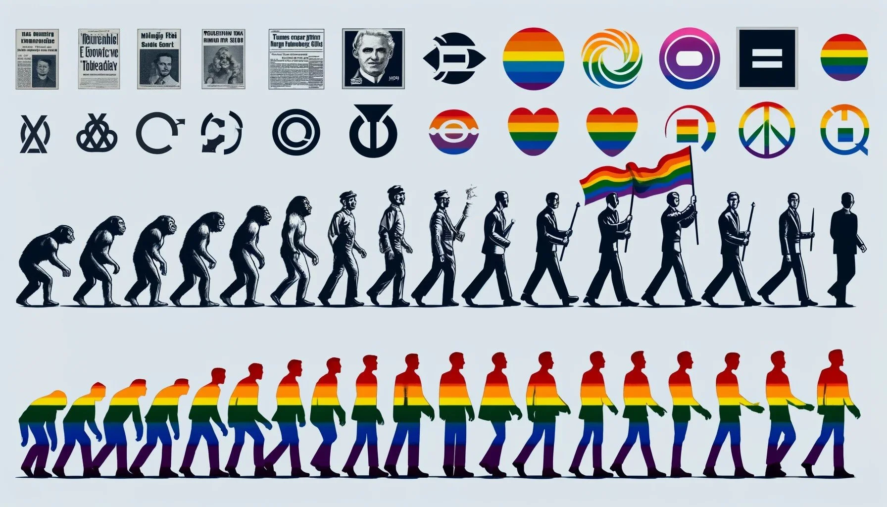
The Iconic Gender Symbol: The Pride Month Flag(s)

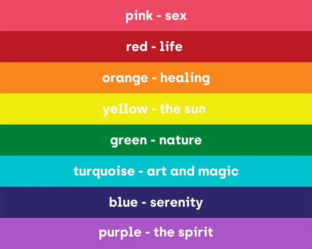
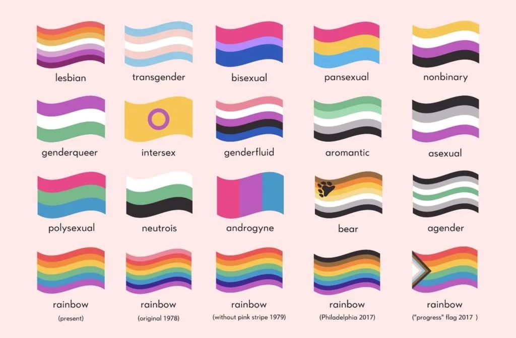
The image above is an illustration of as many pride month flags as I could gather along with a visual representation of the original pride month flag. It wasn’t always the rainbow flag that represented them, as before the flag’s creation, they used many symbols to show their gender identity such as…
“a pink triangle as visual representation. This was adapted from badge that gay prisoners were forced to wear in Nazi concentration camps”
“Other symbols used by LGBTQIA2-S groups include green carnations, purple hand prints, Greek symbol lambda, blue feathers, and ace playing cards”
In the late 1970s, the first elected official who was openly gay, Harvey Milk, decided to ask his friend Gilbert Baker to make him a symbol to represent at what the time was just the gay community. Baker collaborated with his friend Lyn Segerblom (also known as Faerie Argyle Rainbow) to make the rainbow flag that has become the symbol of all in the LGBTQIA2S+ community.
(image found by JustEnoughWines.com)
They originally made it to have 8 stripes, each color symbolizing something, but since the pink and turquoise stripes became hard to manufacture, the flag was simplified to the modern day 6 striped flag. Of course, that wouldn’t be the end of making flags for Pride Month or updating the original flag, but for people today, the rainbow is the most iconic symbol for gender diversity and it only came about relatively recently in comparison to how these groups were treated for hundreds of years.
(image found by Department of Mental Health)
Now For the Racial Angle
Now, for the racial side of this, within the LGBTQIA2S+ community there was a change made and a new flag was created in 2017 called the Philadelphia Pride flag, which added brown and black to the flag to uplift people of color within those LGBTQIA2S+ communities after all the years of discrimination and exclusion toward Black, Indigenous, and other People of Color (BIPOC) within those communities.
Speaking of BIPOC, even without the exclusion within LGBTQIA2S+ communities, the others of the BIPOC (Black, Indigenous, People of Color) groups were also discriminated against even longer than the gender groups. After all, the biggest discrimination that lead to much worse for people was slavery and nothing will erase that ugly stain from history. However, we as a people should stand with those groups in solidarity and designers should be giving them symbols to stand with them.
“A 2019 census of the US design industry by the American Institute of Graphic Arts and Google found that 71% of employees were white. 8% were Hispanic, another 9% were Asian and only 3% were African-American. That is 318 black designers among the 9,429 surveyed”
That’s not all, as it also appears that the industry takes designs from black culture and refuse to give them credit to all kinds of microaggressions that do impact BIPOC designers in the field.

“Having something that was a lot simpler—just a wordmark—ended up being just as powerful and a better shorthand than a complex illustration”
In terms of logos in general, the one that has become synonymous with BIPOC is the logo for the Black Lives Matter movement that is still relevant to this day. Now, what stands out about this is the fact the movement is just that, a social movement so the original founders of said movement were not focused on a logo because they weren’t a business looking for money. What they came up with was a simple font on a striking yellow background, to symbolize the severity of the movement so people knew what they were protesting for.
What’s Left For Us To Do?
Now, as you can imagine, I am just a designer who writes about this topic. I am not a member of either group, but because I advocate for those peoples’ rights and responsibilities do I care enough to write this. They have been put down, oppressed and many worse things throughout history, yet here we are in an era of change and starting to change how these people are treated.
Even if it’s something small like a symbol or a logo, those go a long way in making a difference in the world. After all, it took a team of two to make the first Pride Month flag and those are continually changing, and the Black Lives Matter movement made a wordmark to symbolize a social movement. If we continue to advocate and show our support, then real change is in store for the future.

Hello, I am Joseph Crickmore.
But you can call me Joey. I love art and design, and anything else that can be created with my own hands. I have a younger brother who has an autistic disorder, so I always show my support on World Autism Awareness Day.
I myself am a designer, content creator, and freelance artist for commissions.
